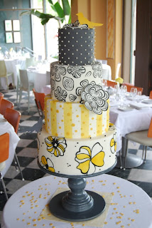
 People always ask me how I come up with so many unique cake designs. Don't I ever run out of ideas? The answer is simple. Emerson knew it, and I live by it..."Genius borrows nobly". The only thing he forgot is the "Evil Cake" in front of Genius, but hey, we'll give him a break, he's Ralph Waldo Emerson (and, I'm actually making his great, great, grandson's wedding cake this October...but that's another story).
Onto my knack for Plaigiarism...
Stacy and Andy came into the shop with the usual "wedding file" bursting with inspiration for a hungry cake designer. I love these files, I've seen huge expandable accordion files, the usual ring binder, the latest...ipad wedding file, and my favorite of all time, Dawn Strauss (hi Dawnie!) who would show up at my shop with giant rubbermaid tubs full of inspiration. Stacy and Andy had a lot of beautiful inspiration, but it was their incredible hand-made inviations that grabbed me instantly. Each invitation would have one of four bold, beautiful fabrics ironed on to the back of the card. Enclosure cards as well, so that each invitation had a mixture of patterns packed into one lucky envelope.
Now, the cake lady has no eye for this stuff, I would never put together these varied patterns and colors, but I do know a good thing when I sees it, so I pounced. How about a four tier cake patterned with each of the four fabrics? The grey background with dots, would become grey fondant with 3-D spheres, the pale gingham with opaque polka dots would become airbrushed stripes with fondant applique dots and beads, and the floral patterns would stay in their floral-y glory.
 We had a photo shoot coming up with Minneapolis St. Paul Weddings. Typically, I'll make them a dummy cake, but when I got the call, I offered one and only one cake. This one. Being the fabulous creative folks that they are, upon seeing the sketch, they sent out one of their photographers to shoot this little lovely on site...on a Sunday.
So, Stacy and Andy, chalk one more published cake to the Evil Cake Borrower, and thanks for giving me the inspiration for one of my favorite designs of all time.


